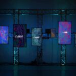
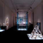


Design is not the work of a soloist, but a collective alchemy. In this issue, we explore the boundary where individual ideas yield to dialogue, transforming creativity into a common ground. Collaborative work is not a simple addition of signatures, but an exercise in trust: a harmony that transforms private dialogue into a design method, capable of evolving artisanal expertise into a choral research. This chorality is fulfilled in space, the theater of relationships.
From the civic “porosities” of Neri&Hu in Shanghai to the underground stations of Anish Kapoor in Naples, architecture ceases to be a shell and becomes a threshold for encounter. It is an energy that traverses the monumental scale of Francis Kéré’s museum in Las Vegas and is reflected in the intimacy of the studio-homes designed by Homu Arquitectos or the Lascia la Scia quintet, and in the Parisian rigor of Vincent Eschalier. The narrative culminates in the Album section: here, the living area is the nerve center where organic forms and sculptural tables define new geometries of togetherness.
From the icons of Modernism to the maps in the book This Is Where We Live, the lesson is clear: excellence is not a solitary goal. Designing with multiple hands means accepting incompleteness to achieve a higher balance. Because a project is “right” only when it knows how to sit at the same table with history, matter, and, above all, the other.