Despite the sanitary emergency and the cancellation of almost all the trade exhibitions, Made in Italy goes on. Cristina Rubinetterie, for instance, introduces a new image, a new logo and the recent launch of the new AddWater catalogue.
Read also the interview to Daniele Mazzon, General manager at Cristina Rubinetterie
Cristina Rubinetterie: the new logo
A new logo is always a carefully weighed choice, which follows the new corporate identity. In this case, Cristina Rubinetterie opted for a line of continuity with the past, respecting the tradition and values of the company. The key elements stay: the colour, with the yellow square, and the name, Cristina. It is therefore an evolution, a seamless transformation.

Thus, in the new logo, the square and the name Cristina are separated, and the square, symbol of stability, is even more marked, thanks to the square corners. The yellow stays, but now it is in a warmer shade. Finally, the name, which is even more important. Thanks to the new lettering, the C is in evidence, and the payoff becomes the business specialty. The result is CRISTINA Rubinetterie.

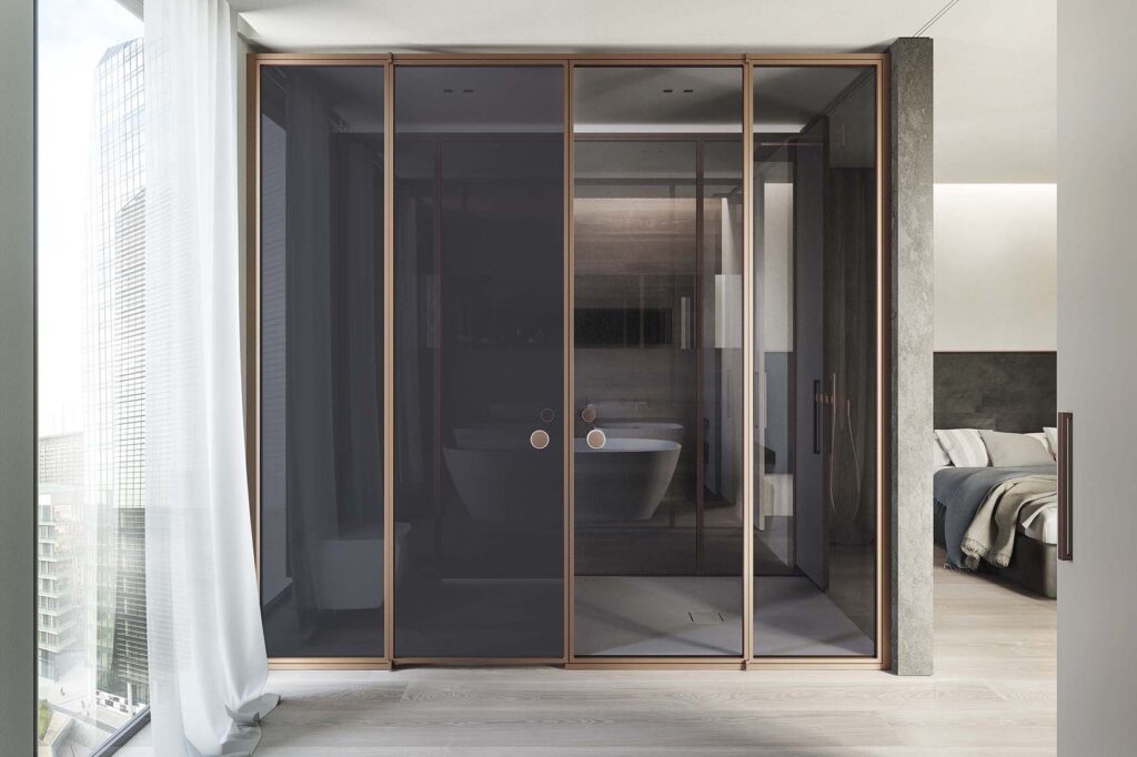
Alongside the new logo, the new image Cristina Rubinetterie features the new catalog, Add Water. The new catalog, with a new graphic image, highlights water, glass, light, and material. Water, a primordial element, takes on even greater importance thanks to the role of light in photographic images. Glass is the material joining the elements, almost like water and light in solid form. A further common thread is the handles, which return as graphic elements in the various pages and become more important in the shape of the different taps collection, which feature different handles each.
Read also the interview to Daniele Mazzon, General manager at Cristina Rubinetterie


