How Interior Design in Horror Films helps create atmospheres of Suspense and Terror, from the Dark Rooms of Dracula to the Intricate Hallways of The Shining.
Horror movies use interior design as a visual tool to heighten the sense of fear and tension. From the gothic castle of Dracula to the chromatic symbolism in The Shining, furniture choices have profoundly reinforced the atmosphere and storytelling of these iconic films. Below, we show how interior design can intensify the horror experience.
4o mini
Claustrophobia and Confinement
One of the most common techniques in horror is the use of cramped and suffocating spaces, which convey a sense of entrapment with no way out.
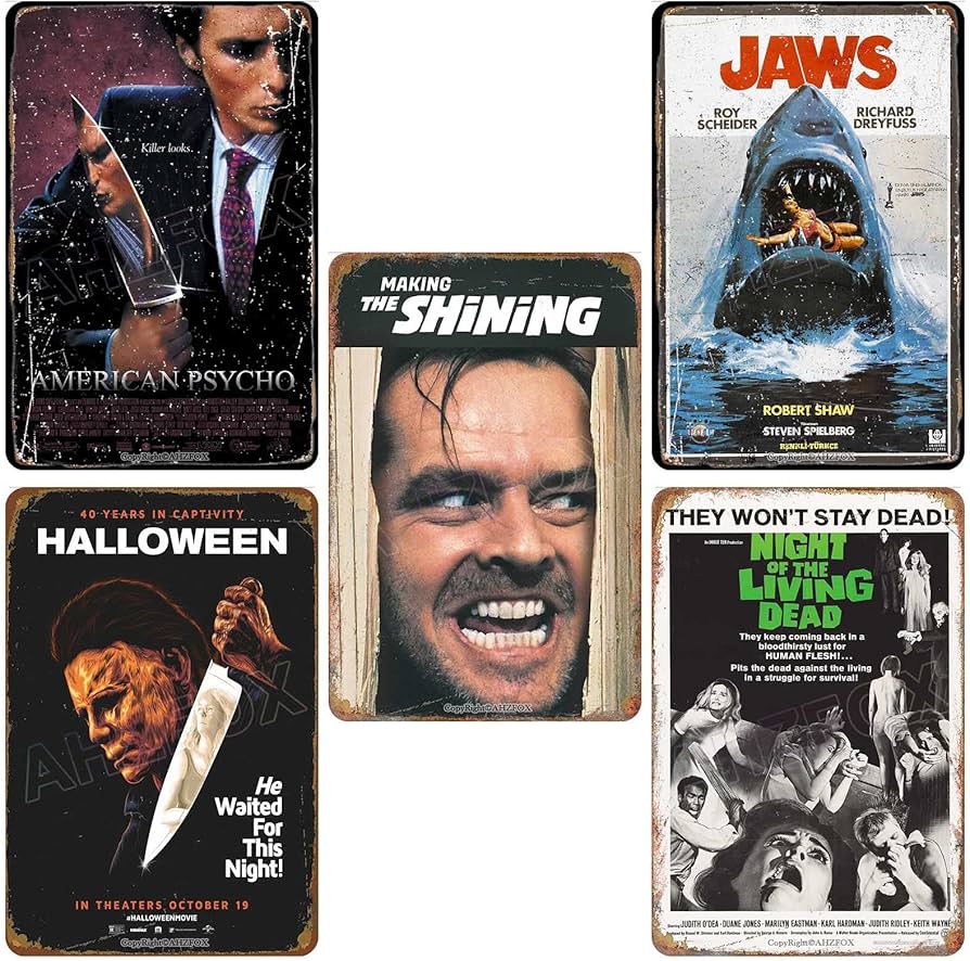
The Shining
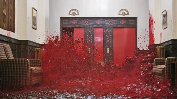
The labyrinthine Overlook Hotel, with its narrow corridors and dark color palette, creates a sense of disorientation and entrapment. The rooms are dominated by dark tones and imposing furniture, contributing to a perception of decay and abandonment.
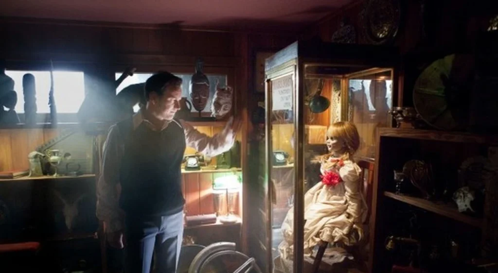
The Conjuring
The Warren home features cramped spaces and dim lighting, amplifying the sense of vulnerability. The scattered religious objects, such as crucifixes and Bibles, heighten the unease in an environment that appears familiar yet hides a threat.
Darkness and Shadows
The use of shadows and grim atmospheres is essential for creating suspense.
Halloween
In Halloween, the figure of Michael Myers looms in the shadows of a quiet suburban neighborhood, exploiting the contrast between bright exteriors and dark corners to intensify the horror.
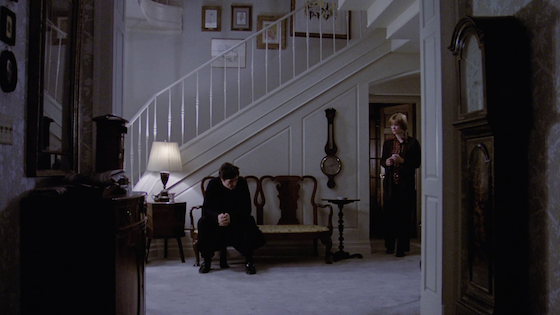
The Exorcist
The interplay of dim lights and shadows in the Regan family’s home creates an aura of mystery. The dark furnishings and heavy curtains contribute to a sense of oppression and unease.
Decay and Abandonment
The themes of decay and abandonment are recurring in the interior design of horror films.
The Amityville Horror
The haunted house, with broken windows and overgrown vegetation, conveys a sense of past suffering and violence. Peeling walls and decaying furnishings further enhance the dark and menacing atmosphere.
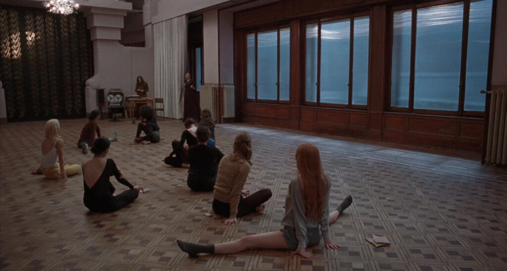
Suspiria
The dance academy in Suspiria is a perfect example of decadent Gothic aesthetics. The dark, dilapidated spaces, enriched by hidden passages, evoke a perverse and unsettling beauty.
Gothic Elements
Gothic elements, from stained glass to heavy tapestries, are fundamental in many horror films as they help create macabre and mysterious atmospheres.
Dracula
The Gothic castle of Dracula, with its sumptuous details and stained glass windows, creates an atmosphere of decadent grandeur, suspended between elegance and impending threat.
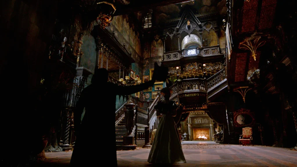
Crimson Peak
The decaying Allerdale Hall in Crimson Peak, with its narrow corridors and hidden secret passages, perfectly embodies Gothic elements, giving the film an unsettling atmosphere of luxury.
Symbolism and Anticipation
Visual symbols and foreshadowing are powerful tools that help suggest danger and generate suspense.
The Shining
The red room in The Shining foreshadows tragic events and evokes danger and violence through the symbolism of the color red.
The Exorcist
The religious symbols present in The Exorcist represent the conflict between good and evil, adding depth to the narrative.
Interior design in horror films thus plays a key role in building atmosphere, heightening terror with carefully crafted details. From The Shining to Crimson Peak, the strategic use of shadows, Gothic elements, and spatial contrasts demonstrates the power of design in evoking emotions. These furnishing techniques not only inspire filmmakers but also captivate audiences, amplifying the impact of the story.
Discover here how to decorate with the style and glamour of Emily in Paris.


