

Vudafieri-Saverino Partners defines the concept design of the new Matanē, a Japanese street food restaurant with a pop touch
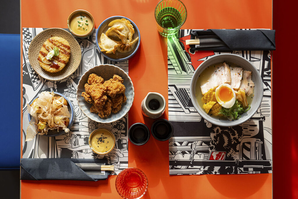
Urban and contemporary Japan is the inspiration that guided Vudafieri-Saverino Partners in defining the concept design of Matanē, a 42-seat Japanese street food restaurant with a witty and pop touch, which is opening its second space in Milan in the elegant Piazza Wagner 6. The main star of the menu is the onigirazu, a rice sandwich enclosed by nori seaweed and stuffed with different fillings, born in the 1980s from manga culture.
The new concept design will also cover Matanē near Porta Garibaldi, which opened in 2021, known for being the first restaurant in Milan to offer this specialty.
With this restaurant, architects Claudio Saverino and Tiziano Vudafieri add another chapter to their list of places that include many examples of interpretative eclecticism, as in the cases of Ristorante Berton, Dry, Røst and Kanpai in Milan, Terrazza Aperol in Venice, Chez Pierre in Monte Carlo Paradiso in Abu Dhabi and Cannes.
Manga culture and traditional Japanese cuisine
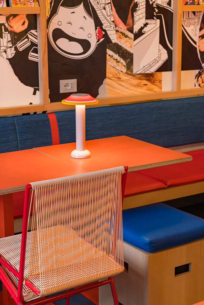
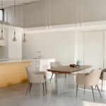
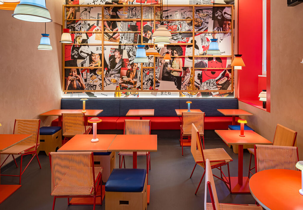
Matanē’s 78 square meters are divided into two rooms, accommodating 42 people, to which a small dehors is added in fine weather. To create an experience capable of connecting the pop culture of manga with that of traditional Japanese cuisine, Vudafieri-Saverino Partners focused on the typical characters of Japanese design and world.
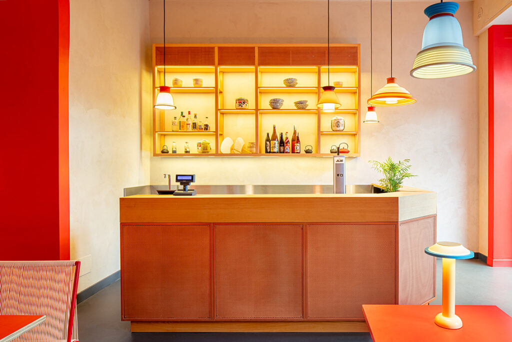
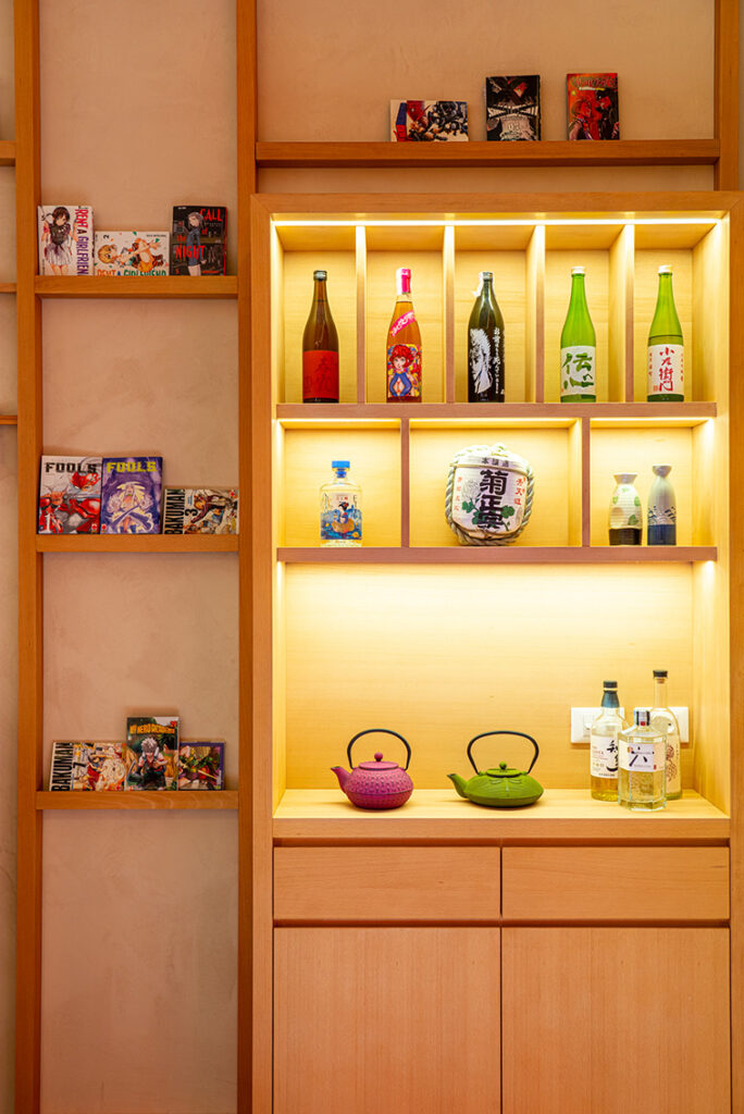
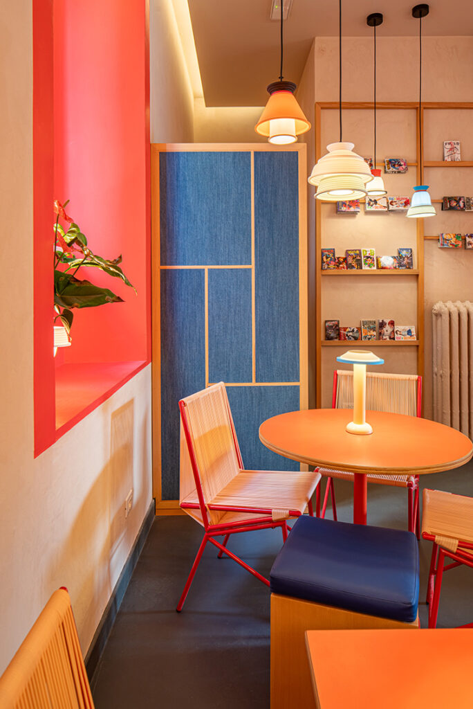
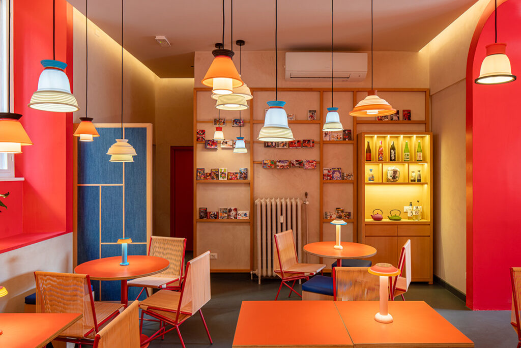
Starting with the atmospheres and streets of Tokyo, filled with lights, signs, street food places and color overlays, found in the wallpapers and multicolored silicone table and ceiling lamps from Sowden. Also the light wall-mounted bookcases designed by the architects recall Japanese tradition. In particular, they reinterpret the fusuma and shoji panels and sliding doors that delimit the spaces of typical Japanese homes.
Colors and textiles from Japanese culture
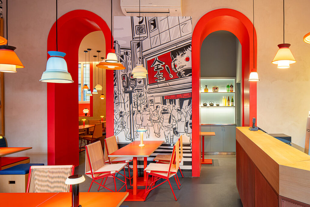
Color plays a prominent role in defining space and guides all interior design choices – from lighting to furniture to graphics on the walls. A symbol of good luck and happiness, red – a sacred color par excellence, used in Japanese architecture to represent deities and decorate Shinto temples – is used in different shades for tables, seats, benches, and upholstered furniture. Giving an even more pop touch is the use of denim, a fabric of which Japan boasts excellent production, here used for cushions and screens.
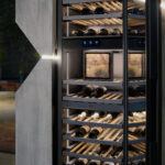
At the entrance, the wooden counter with copper mesh panels and the wall-mounted bottle rack, both designed by Vudafieri-Saverino Partners, take center stage. The urban character is also found in the bathroom, where the atmosphere of Tokyo streets is reproduced through white-striped decorations, evoking pedestrian crossings, a traffic light and images projected on a loop.
Photo: Andrea Fongo