Edward Barber and Jay Osgerby talk about them and the great success that brought them to the Met at the beginning of their design career. Very British, very international!
Edward Barber and Jay Osgerby, during twenty years, have contributed to defining contemporary design. They told us their story through ten projects that sanctioned their success. A really industrial approach emerges, being the result of a privileged relationship with companies and a special attention to detail, going beyond the product to reach the fields of architecture and exhibition design.

FROM THE DEBUT TO THE MET!
“The Loop Table was originally designed for a restaurant in South London, while we were still students at the Royal College of Art, but the cardboard model sat on the shelf in our studio for a year before we finally decided to have a prototype made. The seemingly simple design requires great accuracy to manufacture.” The duo looked for a manufacturer and met Chris McCourt, (owner of a woodwork shop in west London and of Isokon, the highly experimental furniture company first set up in 1935 under the direction of Marcel Breuer) who was so taken with the table that it was introduced into the prestigious Isokon range. Then, the table was displayed on the stand of the ‘Wallpaper’ magazine that in 1997 was in its first year, and was spotted by Giulio Cappellini. This is how it was presented at the Milan furniture fair in 1998 as part of the Cappellini collection, company with which a long collaboration started. That’s not all: the Loop Table was soon acquired by both the Metropolitan Museum of Art in New York and the Victoria & Albert Museum in London.

SONY INSTALLATION AT FUORISALONE, MILAN
“The commission, with our partner company, Universal Design Studio, was to create an exhibition for Sony in the Villa Stendhal, on Via Tortona in Milan, during the 2010 fair. It was Sony’s first stand-alone exhibition at the Furniture Fair. Our thinking was to create abstract objects for the everyday living environment, to show suggestions of how the Sony technologies might appear in our lives. We found it most interesting to explore abstracted, pure forms, each one representing a different area of the living space. We used simple raw materials, since these seemed a strong partner for the great complexity of the microtechnology that they were paired with. In forming and resolving our ideas we came to four new archetypes that to us represented all the possibilities of the new Sony technologies in the home. The setting for this experiential revelation is an anechoic chamber (a room of total silence); created by sound absorbing cones to create a noiseless space. Anechoic spaces allow for a keen sense of hearing, our vision becomes sharper, leading us to tune in to the reality of the things around us. We invite the visitors to focus their senses.”

LIMITED EDITIONS AND RESEARCH ON COLORS
“Designed for our first gallery show with ‘Established and Sons’ of limited edition pieces (5 tables were produced as a limited edition of 10 with hand-finishing processes creating subtle differences within the edition). The final form, a faceted hoop with no beginning or end, was determined by extensive circular colour studies undertaken in the studio. The individual aluminium segments were precision machined and hand-dyed in anodising tanks, which embed the colour into the surface. The tops are made from low-ion glass to prevent alteration of colour on the interior and exterior surface. Although the process of machining and bolting is industrial, the result is a lyrical, seamless, tessellated object, the name of which refers to the colour striations of the eye.”

AN ERGONOMIC CHAIR (NOT ONLY) FOR STUDENTS
“It was obvious that this chair, originally designed with secondary school children in mind, should live as comfortably in a kitchen at home, as in a classroom or at a desk. It should offer movement, be comfortable, hardwearing, but also visually memorable and beautiful. Unlike an office chair it has no moving parts, but tips forwards helping to straighten the pelvis and spine and improving circulation. This feature, the need for movement, resulted from extensive research into ergonomics, medicine, movement and posture carried out with Vitra into new ways of working. There were thirty prototypes during the two-year development with Vitra. It was decided to produce the chair in plastic for lightness.”
THE TORCH FOR THE 2012 LONDON OLYMPICS
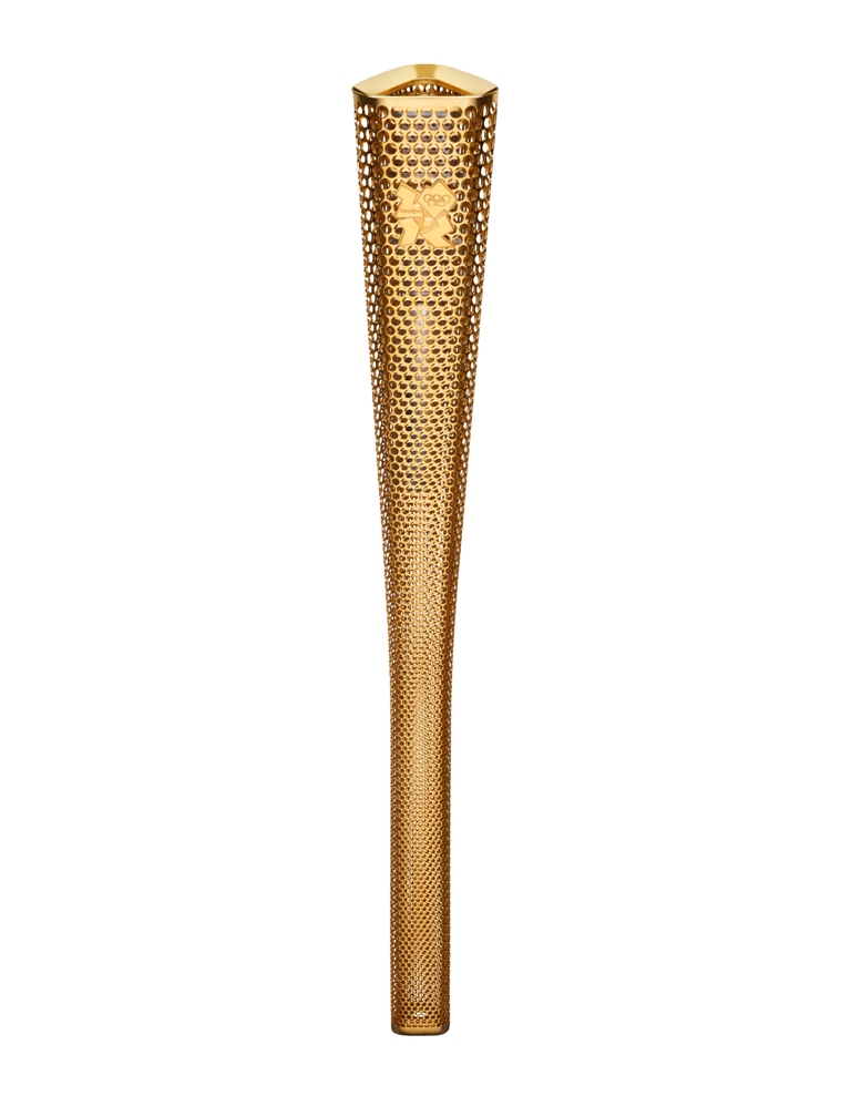
“We were awarded the prestigious honour of designing the Torch, which was carried across the UK for 70 days leading up to the Opening Ceremony for the 2012 London Olympics. The Torch’s trilateral form was developed in recognition of a pattern of trinities in the history of the Olympic Games: this was the third time that the Games have been held in London (1908, 1948, 2012); the Olympic motto was ‘faster, higher, stronger’; and the vision of this Games was to unite ‘sport, education and culture.’ The shape of the Torch enables easy grip, as does its tactile surface, perforated with 8,000 circles using cutting-edge laser technology. These circles symbolise the 8,000 individuals who took part in the Olympic Torch Relay and also create a unique level of transparency in the Torch, where you can see right to the heart of the Flame. Functionally, the circles reduce the Torch’s overall weight and ensure that heat from its Flame is quickly dissipated without being conducted down the handle. This Olympic Torch is one of the lightest ever, crafted from aluminium alloy, which was developed for the aerospace and automotive industries.”
THE OFFICE CHAIR USED AT THE APPLE PARK, CUPERTINO
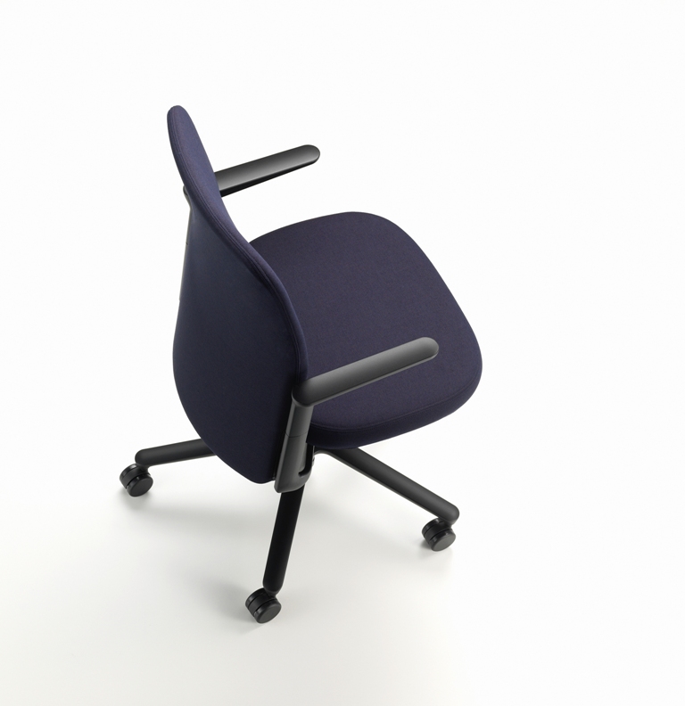
“The Pacific chair was our first office seating for Vitra. We saw that the traditional office chair had become a collection of controls and levers, a mechanical contraption. So, we re-thought the design in order to minimise the visual impact of those elements. In collaboration with Vitra, we developed a new mechanism that responds to the individual weight of the sitter. Further lumbar adjustment is provided from a seated position by the vertical movement of the entire backrest. Apart from the base, the mechanical parts of Pacific are concealed behind a rectangular backrest, which extends below the base of the seat. The height of the back can be adjusted, and the furniture adjusts automatically to each sitter. The Pacific chair is available in several different sizes and finishes. The Pacific chair was launched at the Orgatec Trade Fair, Cologne, 2016. It was chosen by Apple for the Cupertino, Foster designed, Apple Park.”

THE KINETIC SCULPTURE MOVED BY THE WIND
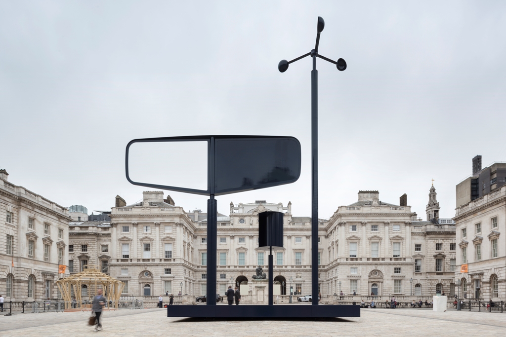
“We delight in challenging the boundaries between design, architecture and art, so the opportunity to represent the UK in designing a major installation for Somerset House during the first London Design Biennale was perfect. The theme of the Biennale was Utopia, rather ironic as things turned out politically that year for the UK. However, we were inspired by the notion that change is possible and that through imagination we can make change occur in the ways we choose. The installation looked back to our maritime explorer history and forwards to working hand in hand with nature, as well as to the present time. As part of our culture, maritime voyages have traditionally evoked a sense of discovery and adventure, optimism and idealism. By being non-functional, the installation put the emphasis on the power of the imagination to explore, and to come up with imaginative new ways of living. To reach the possible, you have to start by imagining the impossible. The installation also speaks of Britain’s current status as a world leader in offshore wind energy. Constructed from steel and painted, Forecast was a kinetic sculpture that responded to the strength and direction of wind, it was an abstract meteorological machine consisting of three masts mounted onto a steel deck. The footprint of the piece was 10m X 8m and it stood 20m high at its highest point. Forecast was the first piece that we have created that responds directly to the weather”.

THE COIN FOR THE LEGENDARY LONDON UNDERGROUND
“The £2 coin, designed as part of the celebrations of the 150th anniversary of the London Underground, depicts the front of the familiar Tube train emerging from a tunnel and carries an unusual patterned edge inspired by Harry Beck’s iconic Tube map. The Tube emerging from the tunnel symbolically celebrates the Underground’s transition between the past and the future. The coin depicts an approaching train with the outer ring of the coin used graphically to suggest the tunnel wall. The rails traverse the outer ring, contradicting conventions of a concentric frame, while a line references the ‘exergue’ in classical coins. The front of a train appearing from the darkness of a tunnel represents what many people consider to be the ‘face’ of the London Underground. The train referenced in the artwork is the 1967 Victoria line train, chosen for two reasons: the affinity to the aesthetic simplicity it represents; and the wide recognition of this train due to the iconic status it has gained over the years. A subtle graphic detail inset around the coin edge represents the London Underground line with a number of stations, the last of which conceals the initials ‘B’ and ‘O’ as the Barber Osgerby signature.”

A SEATING LANDSCAPE FOR SMART WORKING
“The workstation is going the same way as the dining room – it’s disappearing as an archetype. The desk has had its day. With mobile technology you need a place to sit occasionally, or a comfortable place to hang out. With the proliferation of freelance careers and the introduction of ‘hot desking’ people can now work almost anywhere. However, finding locations that work for the user is not always as easy. After two-years of research and development we have developed a system where the workstation is focused around a seating landscape. This development combines expertise from home, office and public sectors and offers a versatile platform for both individuals and teams. The sophisticated modular construction of Soft Work features many technical details that enable diverse seating and working positions including pivoting tables and power sockets located between the seat cushions. Partition screens can be used to divide zones and create quiet work spaces. It is an ergonomic sofa design featuring generously padded seat cushions with flexible back rests, creating comfortable conditions for working, even over long periods of time. The Soft Work system features straight and curved elements in single or back to back versions, fixed and pivoting tables, panels, power and data connections.”

THE VISIONARY OBJECT AS BIG AS A BOEING 737-700
“‘Double Space for BMW – Precision and Poetry in Motion’ was designed for the London Design Festival in 2014. It is the largest object we have created – the length of a Boeing 737-700 – and developed from our fascination with aeronautical, automotive and maritime engineering, and the interplay between movement, performance and scale. ‘Double Space’ offered a new and active way of engaging and viewing the famous Raphael cartoons and the gallery creating an immersive and memorable experience. We intended to share our fascination of motion, movement and performance with a kinetic sculpture whose shape was determined by nothing else than optics and the dimensions of the space. Movement had been a subject of our attention and fascination for many years deriving from childhood experience with airplanes and boats. This project created a unique experience that transformed the visitors’ perception of the gallery for the first time.”
The full article by Laura Galimberti was published in DDN-Design Diffusion News #244, December 2018, in the Carte Blanche section

